


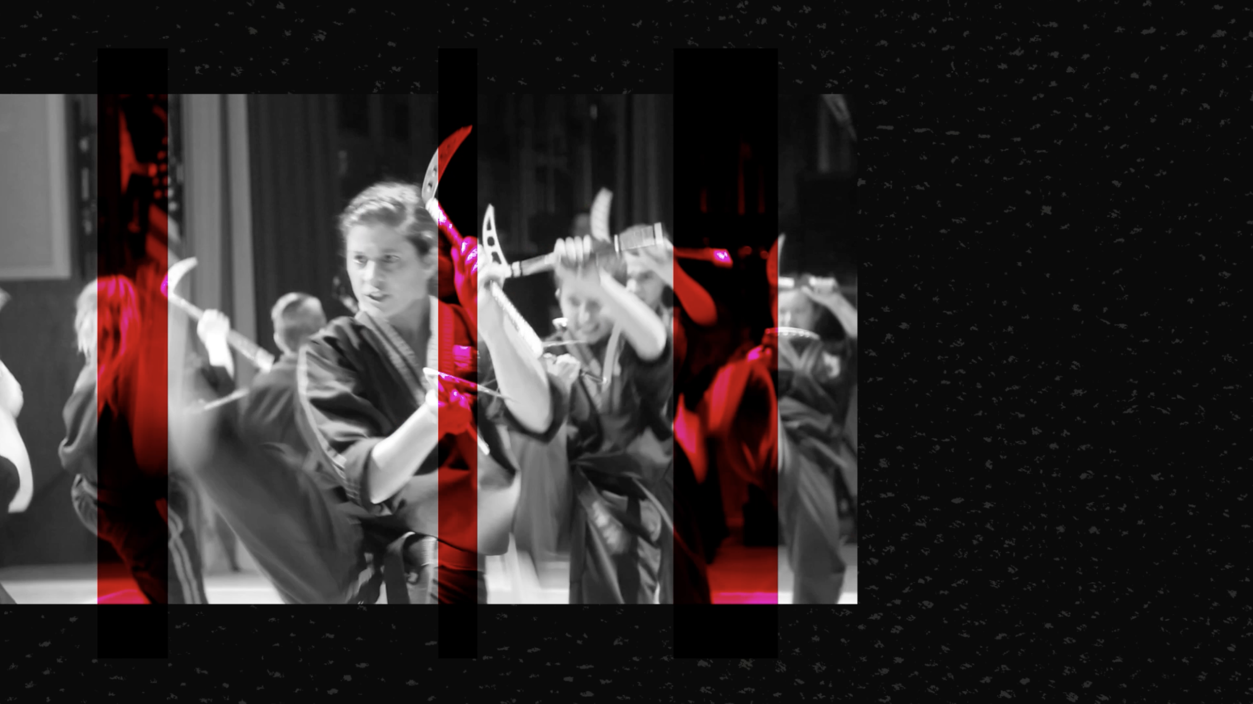

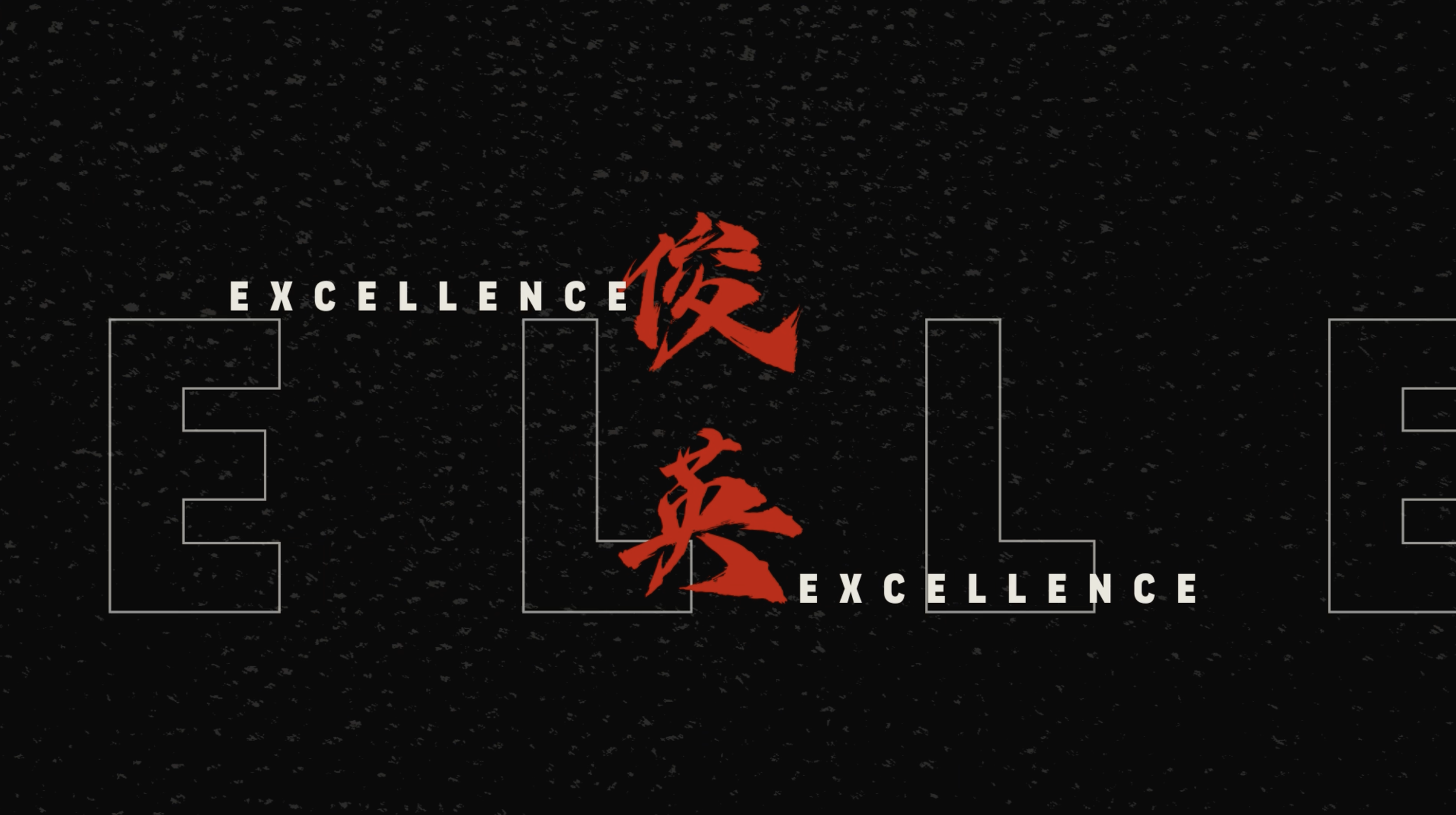

Martial Arts spot. A animation spot for a local martial arts dojo. Colors were kept within the original brand colors to keep it consistent. I used the red color to make certain sections pop. To add and create energy and feeling to the black and white video, I added a pop of red that animated across the screen.


Toyko Throwdown. Theoretical TV open to a dance battle reality show. To really emphasize the hip culture of breakdance, I focused on neon colors, and hard angles. To create contrast, I chose a written typeface to emphasize the artistic and personality part of dance with the san serif font of the names to show the competitiveness side of the show. Part of the School of Motion Design Bootcamp.
Expedition 100. An exploration of TV opening for a space themed documentary program. The bold san-serif typeface and wide tracking of the text really emphasizes the feeling of being in space. I had the text interact with the background images to help create depth and the feeling of desolate space. Additional elements include the subtle squares creating almost a glitch effect of space technology as well as the angled lines to lead the viewers eye to the most important section of the frame. Part of the School of Motion Design Bootcamp.